


Table Of Contents
Finance has always fascinated me. It is ripe with mathematics, very hands-on, it has a global marketplace, the assets are valued all the time. Other interesting aspects are big data, complex relations and the possibility for endless challenges as the market evolves. It is a field perfect for trying out machine learning technology, and who knows maybe hit jackpot if the findings are profitable. But that is not an initial goal.
The goal for me is to set up a platform that allows me to build different trading algorithms and evaluate them.
Initially(this article), I want to
- Find a python library to support building and backtesting algorithms
- Setup an evaluation method to evaluate the performance of a strategy
- Construct a simple trading algorithm to showcase the evaluation
- Run the system on my own laptop on demand
Further down the line I want to
- Have a system that can generate trading signals in different markets
- Run the system on AWS and update automatically
- Have a web frontend which shows the performance of the algorithm(s) and the signals
- Have the algorithms connected to a real account to do automatic trading - far into the future
Of course, this is not an exhaustive list, and many more aspects of it will, without a doubt pop up. So keep reading.
Selecting a python quant library
The first step for me was to select a python library to use as a quant/backtesting platform. I ended up selecting zipline for a few main reasons. It is actively maintained, which seem to be a big problem for many of the quant/backtesting libraries. The documentation looks very good, and there is an active community(as of October 2020, Quantopian is closed down) with many examples to build on. It does have a few drawbacks, the speed is not great, and it should not work very good with non-US data. At least that is what the different reviews tell me.
The speed is not really an issue for me currently since I will work on daily data, so as long as it is able to compute in a reasonable time frame I should be good. I value community and active maintenance higher. Only US data should also be fine since my primary goal is to test out technology so the market is less important for now.
Setting up zipline in docker
It was supposed to be so easy, just download a docker image, boot it and then start building a trading algorithm. But with computers, it is almost never that easy. It took a couple of hours to get it running. The crux of the problem is that to run a zipline algorithm it needs to download data for running a benchmark, the default benchmark is the S&P 500 index tracked by the SPY ETF. But because of a change in URL at Google, the download failed with an exception. A workaround is proposed here, overwriting the default benchmarks.py file with a modified file that uses a local copy of the data.
This showed me yet again why I love working with docker. This overwriting the benchmarks.py in the installation of zipline is essentially a “hack”, and if I just had a local install of zipline I would have overwritten this file and forgot all about it, getting errors again if I reinstalled or updated zipline later.
But with docker, I could just add this configuration to a Dockerfile and it is very obvious what it does.
Dockerfile:
FROM modernscribe/zipline# the current version of zipline references an old google url that makes it impossible to load benchmark data# https://github.com/quantopian/zipline/issues/1965ADD ./benchmarks.py /root/miniconda3/envs/zipline/lib/python3.4/site-packages/zipline/data/benchmarks.pyADD ./data /data
When this error is fixed I can remove it from the Dockerfile, and I will never forget about it. Or at least it should be easier to debug at a later time.
After this setup I can just run the command “docker-compose up” and then I will have a jupyter notebook running on localhost:8888
It looks like this:
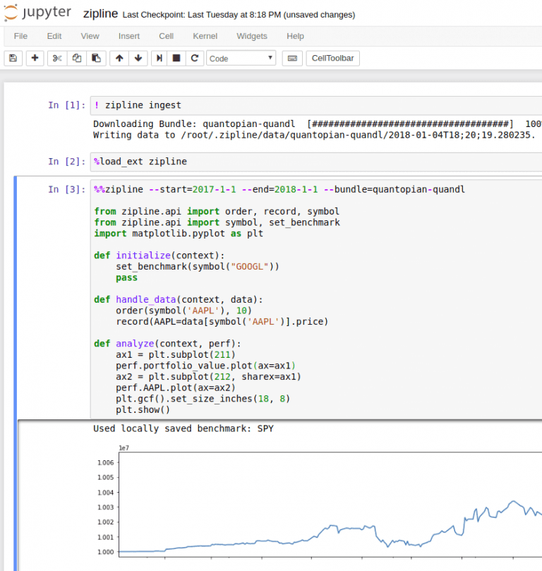
Now it is easy to test any algorithm directly in the Jupyter notebook. Using the magic method %%zipline we can run zipline directly from the notebook without the need to spin up a python cli to run it. This should speed up development quite a lot.
The zipline.io site contains good examples of how to use the framework. Essentially we just need to implement 2 methods, initialize() and handle_data() the rest is handled by zipline. In this example, the algorithm just continues to buy 10 Apple shares every day. Not a very intelligent strategy. The analyze() function is called after the algorithm is done running and allows us to plot returns and anything else we want to do with the data.
Simple example strategy in zipline
To have an algorithm to test on I started with the simple double moving average momentum strategy. In the zipline git repository, it is in the example directory. The basis of the algorithm is to have two moving averages on the price, one short and one long. When the short moving average crosses from below to above the long moving average it signals momentum (buy) and when it crosses from above to below the long moving average it signals weakness (sell). A more in-depth explanation is on investopedia.com. The signals are easily visible in the plot below with the black/purple triangles.
I will use this simple strategy to show and build a way to evaluate the performance of a strategy.
The algorithm is run using the following settings
- 2010-01-01 to 2013-12-31
- Short moving average 50 days
- Long moving average 100 days
- Only apple stock is in the investment universe
- Buy apple stocks on buy signal
- Sell all apple stocks on sell signal
It produces the performance shown below.
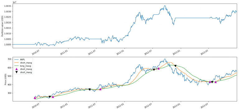
The top graph shows the value of the account over time
The bottom shows the Apple price movement with the two moving averages and arrow markings where the buy and sell signals are. It is a bit difficult to evaluate only based on the graphs, so in the next section, I will try to set up a better evaluation framework, with additional numbers.
In this simple strategy, it is easy to visualize and plot the buy/sell signals and verify when they happen. It is also easy to see on the performance graph that it goes horizontal when a sell signal is hit.
Evaluating the strategy
To evaluate a strategy and compare it to other strategies we need a better setup than just the graphs above. One of the best setups I have seen for getting an overview is the setup Lucena Research use in their newsletters, to present their strategies, shown below.
It contains information that makes it easier to compare the strategy to a benchmark and compare it to other strategies.
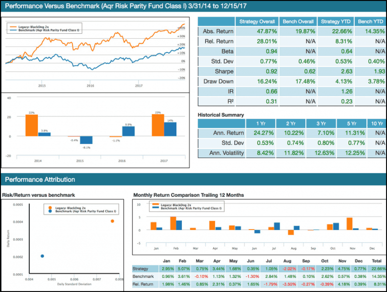
I will use this setup as a template for setting up a similar evaluation screen in zipline. But first an explanation of the different numbers and graphs.
First graph top left, compares the return of both the benchmark and the strategy. This provides a rough overview of the performance compared to the benchmark.
Top right is a table with key numbers for the strategy and the benchmark. The first two are self-explanatory.
Beta explains how much the strategy moves with the benchmark. If the beta is 1 the strategy moves in tandem with the marked. If it is less than 1 the strategy is less volatile than the benchmark, and above 1 it is more volatile than the benchmark. So in this example where beta is 0.94, it indicates that in general, the strategy moves a bit less than the market. Beta value relates to R2 as explained here and here, in short, we should not put any faith into a beta value unless the R2 are +0,6 because if it is to low it shows that the correlation between the benchmark and the strategy is not very high, making beta less trustworthy.
Std. Dev tells us how volatile the return is. That is, how far the return is from the mean of the return. This can be viewed as a simple risk measure. Less is better but the consensus is of course that more risk is needed to generate higher returns. So this measure is best used for comparisons.
Sharpe is the average return in excess of the risk-free return per unit of risk. Higher is better because that means that we get more return with less risk. It assumes that returns of each asset are normal distributed, whether that is a good assumption or not will be left for another time. The range of Sharpe ratios are 1 is good, 2 is very good and 3 is excellent. So with a ratio of 0.92 in the example, it is close to being good.
Draw Down measures the height of a drop from peak to the bottom where it started to increase again. It first resets when the price is above the previous high, so small up/down movements are not resetting this measure. In the example, the strategy has a drawdown of 16,24%. Investopedia mentions that most investors do not want drawdowns in excess of 20% - in this case, they will turn the position into cash to protect them from further losses.
Information ratio(IR) shows how much excess return the strategy generates compared to the benchmark and the volatility it has. It is similar to the Sharpe ratio, but instead of comparing to the risk-free return it compares to the benchmark. As mentioned here IR between 0.40 and 0.60 are considered good.
R**2** compares how close each of the returns generated by the strategy is to the benchmark. The value signals goodness of fit to the benchmark. If it is 1 it indicates that the returns match the benchmark exactly. If it is 0 it does not match the benchmark at all. If the value drops below 0.7 we would say that the strategy does not track the benchmark very good. It can also go negative as described here.
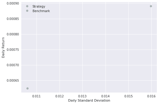
Bottom left a plot of average daily return to daily std. dev. Showing how the strategy compares to the benchmark on return and risk. We want to have the strategy to be as close to the top left corner as possible since this is better return with less risk.
Bottom right, both in plot and table data, the monthly returns for the last 12 months.
Evaluation screen - zipline
Zipline supports pyfolio that contain prebuild evaluation screens to show the performance of a strategy. It gives a complete overview, but in my opinion, it contains so many things that it becomes difficult to compare it, at least for overviews. But pyfolio does have many of the methods implemented that is needed to calculate the numbers we need. So there is really no need to implement them again.
Since one of my future goals is to integrate the performance numbers and plots into a web frontend the focus are not on making them pretty, just useful.
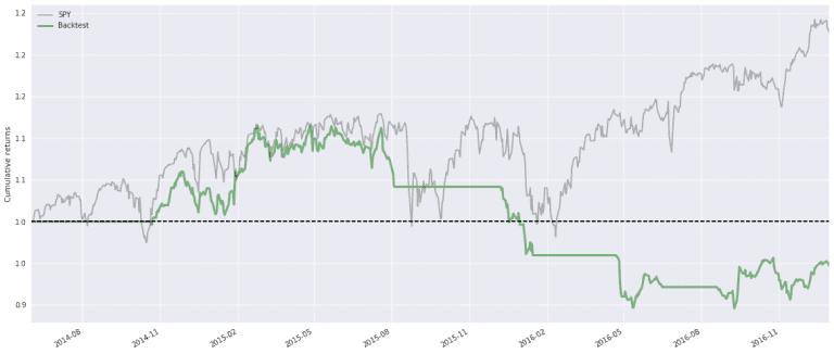
First the plot with the return and benchmark. The grey line is the SPY and the Backtest is as described, working on Apple stocks only. On visual inspection, SPY goes up around 78% in the period, and our strategy goes up by around 110%
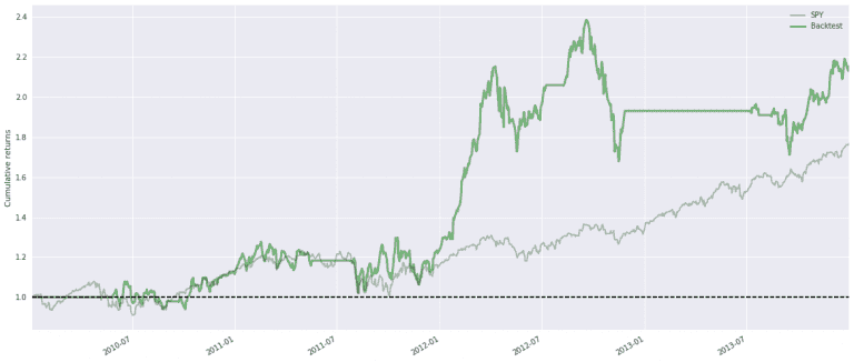
Since the strategy first starts to trade when both the two moving averages are complete, the first 100 days of the plot are 0 for the Backtest. The horizontal areas are where the strategy does not hold any apple stocks.
Next plot is the yearly returns so we can compare the returns year by year. 2012 was a good year for this strategy.
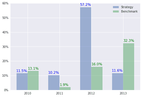
Next is the table with key numbers.
| Strategy Overall | Bench Overall | Strategy YTD | Bench YTD | |
| Abs. Return | 115.56% | 76.92% | 11.63% | 32.31% |
| Rel. Return | 38.64% | N/A | -20.67% | N/A |
| Beta | 0.76 | N/A | 0.14 | N/A |
| Std. Dev | 1.60% | 1.06% | 0.96% | 0.70% |
| Sharpe | 0.88 | 0.93 | 0.80 | 2.58 |
| Draw Down | -29.60% | -18.61% | -12.86% | -5.55% |
| IR | 0.02 | N/A | -0.06 | N/A |
| R2 | -2.45 | N/A | -1.63 | N/A |
The return for the last year broken down in months. The reason for no bars on the strategy in the first 6 months is that the strategy does not hold any stocks in this time period. That is also visible in the top plot with the horizontal line from the end of 2012 to the middle of 2013.
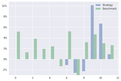
And the same data in table format.
| 1 | 2 | 3 | 4 | 5 | 6 | 7 | 8 | 9 | 10 | 11 | 12 | |
| Strategy | 0.00% | 0.00% | 0.00% | 0.00% | 0.00% | 0.00% | -1.11% | -2.57% | -2.25% | 10.11% | 6.67% | 0.93% |
| Benchmark | 5.12% | 1.28% | 3.80% | 1.92% | 2.36% | -1.33% | 5.17% | -3.00% | 3.16% | 4.63% | 2.96% | 2.59% |
| Rel. Return | -5.12% | -1.28% | -3.80% | -1.92% | -2.36% | 1.33% | -6.28% | 0.43% | -5.41% | 5.48% | 3.70% | -1.67% |
Finally the risk/return plot.
What can we learn from this evaluation of this simple strategy?
It is very difficult to say anything when the algorithm is this simplistic and we only backtest for a short time period. For example, if I change the period to 2014 to 2016 it performs as shown below. Not beating the marked at all. So the strategy is not very stable.
Also, it might not be fair to have SPY as the benchmark for a strategy that is only allowed to purchase Apple stocks. But again it is an example.
The value of the metrics is first visible when there is a better strategy.
The iPython notebook looks like below, so you can reproduce the findings and a copy of project are downloadable here.
Next steps
The way the plots and numbers are generated is a bit crude. It should be wrapped into a separate library so it can easily be reused by other algorithms in other notebooks. I also need an algorithm that can select stocks from a larger universe than just one.
Share

Related Posts
Legal Stuff